Thursday, 14 April 2011

Murphy's Law in Design


This is definitely a new term to me, Murphy's Law. "Anything  that can go wrong, will go wrong" is the basic definition that i got from internet. For examples, bread will always fall jelly side down, you are late and your boss shown up, your computer crash before you saved your works, and when you  stuck in traffic, the other lanes will move faster.

If we apply the Murphy's Law in Design, the result will probably like this, you rushed your design works day and night and it ends up postponed, your clients will always NOT pick the design that you love, your printer will run out ink when you need it.

Well, this is just too pessimistic to me, i rather explain all these situations with unlucky, bad day or coincidence. I did experienced one or two of the situation but it's about my attitude and discipline problem, why the law doesn't apply on others peoples? For example the traffic situation.

I believe if you planned your schedule nicely, and complete all the task given and planned then things will be fine and it should be. It's about how you think, so think positively and be optimistic, what's the point of being pessimistic since the life is filled up with so many unexpected.

There are so many examples here, look at these and have a good laugh
http://www.ashok88.com/2010/02/murphys-laws-very-funny-true.html
 

Friday, 1 April 2011

Ideas?

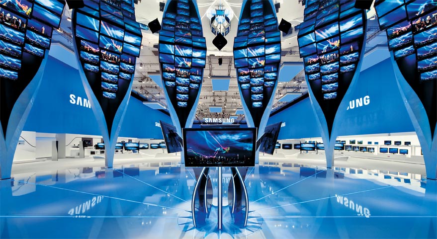
It's time to start doing some research and choose the company you prefer for project 2, exhibition design.
Exhibitor Online a website which organize an exhibit design awards annually, the point is they provide the examples of exhibition design of past year winners. You can go through of it and take them as precedent studies as well. Winners of 2007 2008 2009 2010. All of the examples are very inspiring, good use of the materials, the space in order to create the atmosphere and design which are suitable for the brand's concept.


Beside of the inspiring examples, you can also find some useful tips about exhibition design here. Planning, budgeting, graphics and even tips for promotion and tricks to make a small exhibit stands out.
This website really save you a lots of time on searching for good examples/precedent studies, the only bad is you have to pay for certain articles.

But what i have mentioned above is totally free! I guess it's much more enough for our current project.


 *all the images taken from http://www.exhibitoronline.com/index.asp

Thursday, 24 March 2011

[share] Funny.Clever.Original SIGNAGEs

Besides the signage we normally seen around us, here are something funny yet cool signage around the world. They are the result of a signage photo contest. You can really have a good laugh when you looking at these signage. I'm sure you can't apply this kind of signage for our Project 1, directory sign. This is just for inspiration and entertainment. Who knows? You might get some incredibly ideas from that, good lucks.

http://www.smashingmagazine.com/funny-clever-original-signs-part-1/
http://www.smashingmagazine.com/funny-clever-original-signs-part-2/
http://www.smashingmagazine.com/funny-clever-original-signs-part-3/

Thursday, 17 March 2011

[share] Paper Art and Paper Sculptures


Hey guys, check this link out for the awesome paper art and paper sculptures.
http://www.hongkiat.com/blog/masters-of-paper-art-and-paper-sculptures-part-ii/

Instead of drawing on the paper, the masters turn the paper into an artwork. You can't deny their creativity of turning the blank papers into any kind of animals you name it. Owl, eagle, horse, goat, tiger and even human and building. They don't just simply cut out the shape, they care about every details of the paper art & sculpture, fur especially.

Of course, you need a very skillful technique and experience in order to achieve that, but for me the main important requirement is the patient and the passion. You have to focus and really concentrate on every cut and carve. Same goes to the model making we are going to deal with later. Making a box is easy but it's hard if you want to make it nicely done. It's even harder for model making. So, be patient! Don't rush to finish it quickly, do care about the quality! Act like a master :)

You can also check this out for more inspiration.
http://www.hongkiat.com/blog/beautiful-examples-of-origami-paper-art/

Saturday, 12 March 2011

Navigational Design

Main Entrance of Putrajaya Sentral


Last week, i went to the Putrajaya Sentral to do my research for the Project 1 of Environmental Design. Many pictures of signage design are taken by me  for references and studies. I also try to looking out the best placement for my primary directory sign.

> As i walk through of it, i find out most of the signage are above the eye level, they are very well designed graphics with captions and even highlighted with green borders. It's very eye catching together with the black background. 


<  Instead of having another signage board, a green highlighted line was insert as the divider for two different direction of signage. This is quite smart and cost saving.


> The position of this signage is not that appropriate for me as it's position is simply too high. This signage is right on the entrance of KLIA express. It's not that easy to be notice.


 < There are another design of signage, white color of graphic with blue background, they are hanging beside the wall and used on showing the public facilities provided like public phone and lift.                


>  You couldn't find the ATM service on the signage board, it's left out. This is because the ATM machine was built after the set up of signage board i guess.   

 < You can also find some no smoking and no entry signage on the wall or the elevator just for reminding purpose.


> Besides that, there are many others signage in the building, toilet for men, women, the disabled, prayer room, and also store room. The design are very simple and consistent.
< For the ground floor, it's basically for the bus, taxi, and parking purpose. So, you can see some signboard with platform number on it, it's also stated out the which the company of the bus belong to. Each schedule of the bus are also provided and well categorized on the big signboard, passengers can check out the correct time schedule of every bus.


Before i end my research, i decided to put my directory sign on the main entrance of the Putrajaya sentral, right on the middle of it. This is the most suitable position i think.